BRAND DESIGN
Hotpotatoes Chill Beats
DATE
Jun 2023
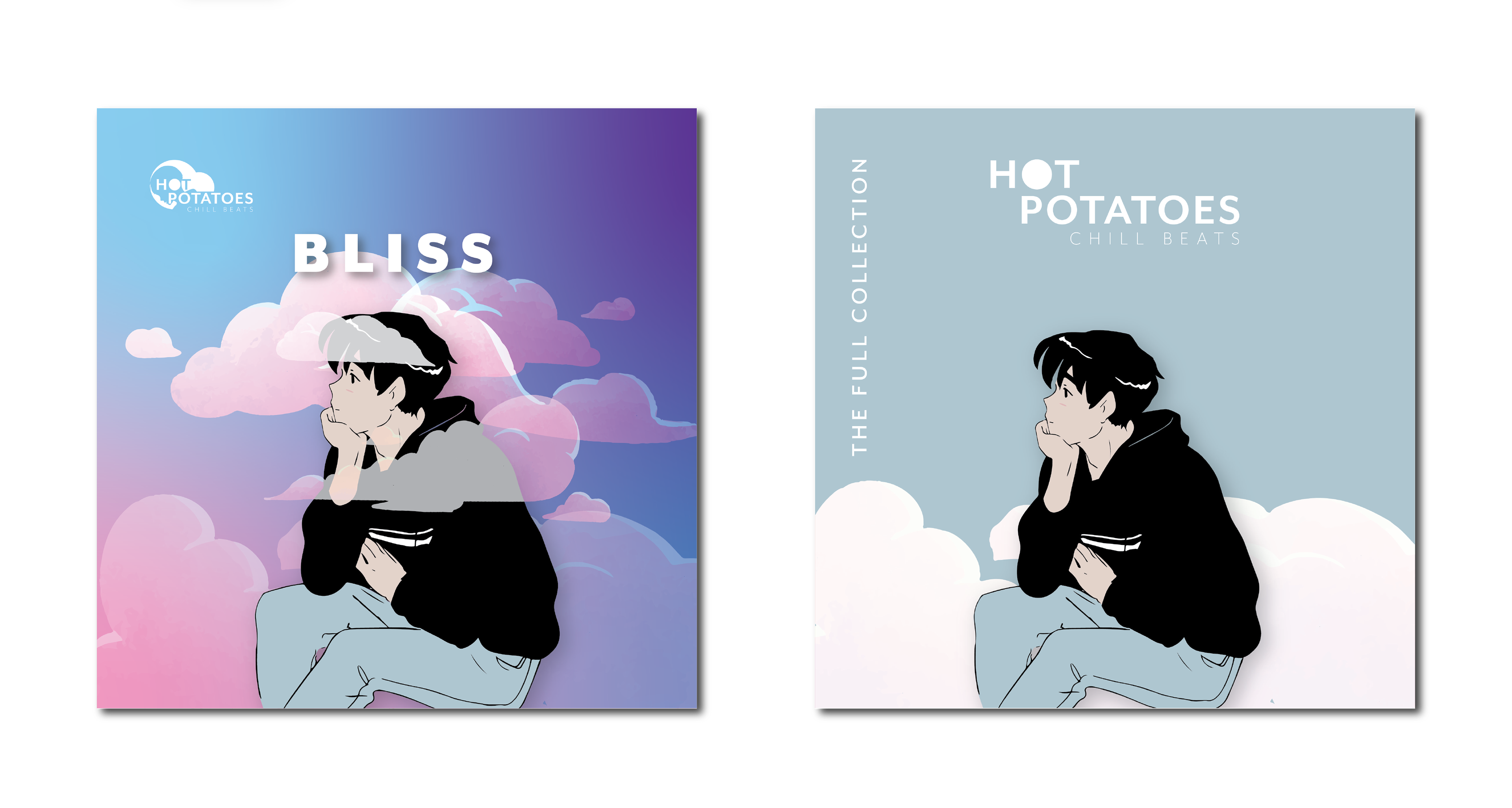
HOTPOTATOES is the creation of a Singaporean musician who produces piano-based Lofi music. His music reflects a chill and mellow personality, with dream-like quality and a pinch of romance. Currently, the creator of HOTPOTATOES is mostly represented by an anime boy on his Instagram account where he promotes his music.
For the new brand identity, the anime boy needs to be preserved while reflecting the brand's personality and the musician's preference for pastel colours.
Logo Development
During this stage, I explored the direction of incorporating the anime boy, the brand chill personality, and element of lo-fi music into the logo.
I had the idea of an anime boy creating music amongst clouds. Hence, I explored drawing and combining anime boy figures, clouds, piano, and vinyl.
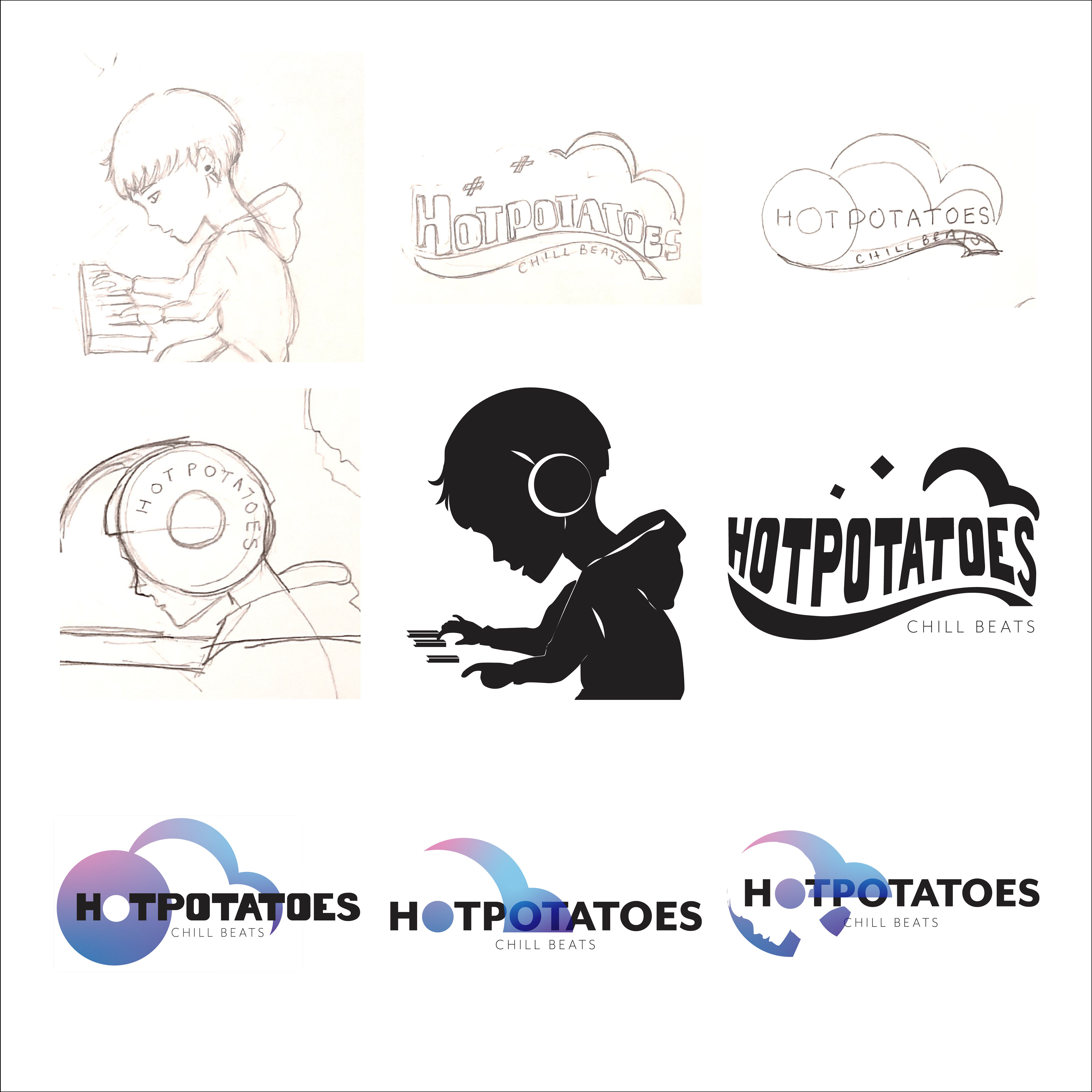
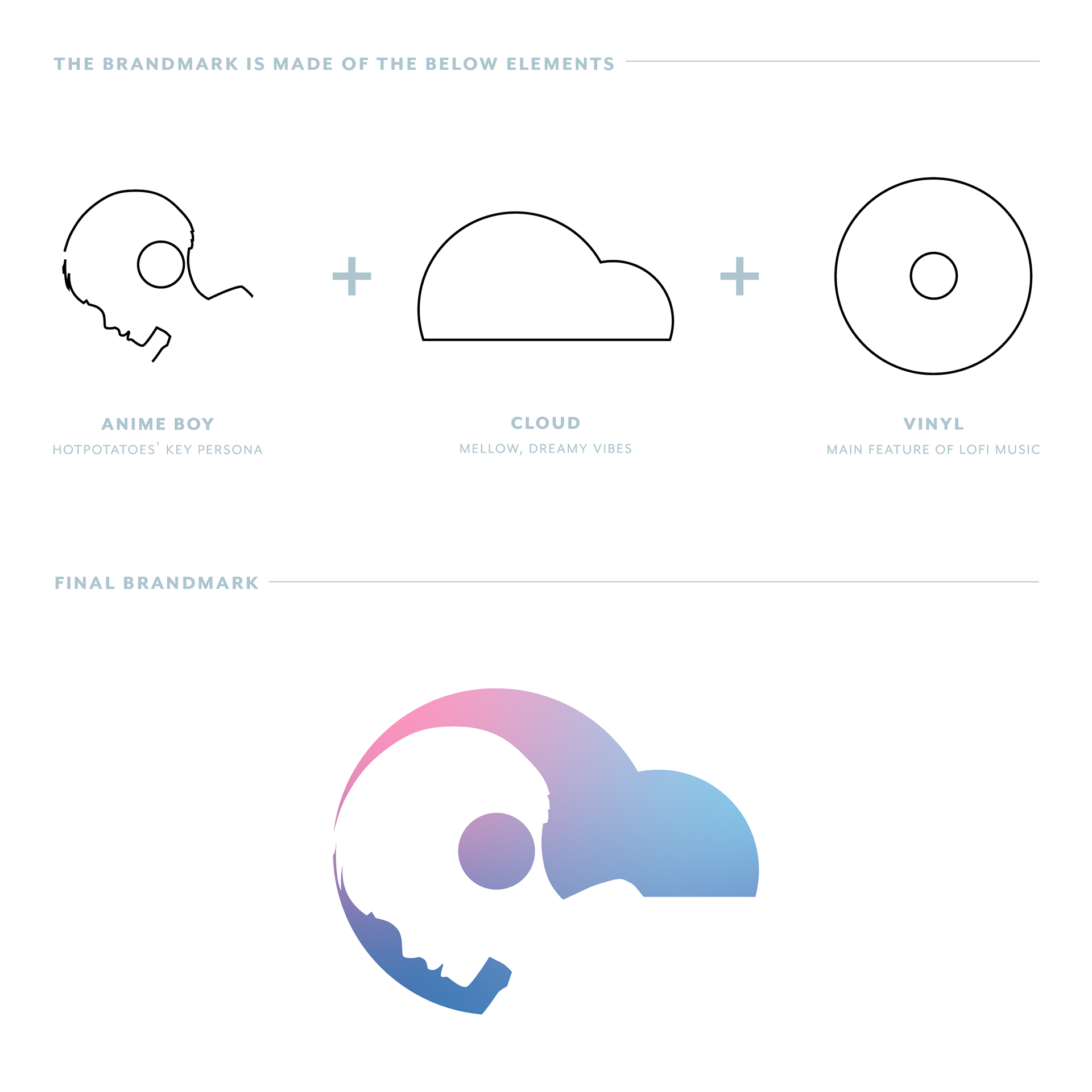
Logo Rationale
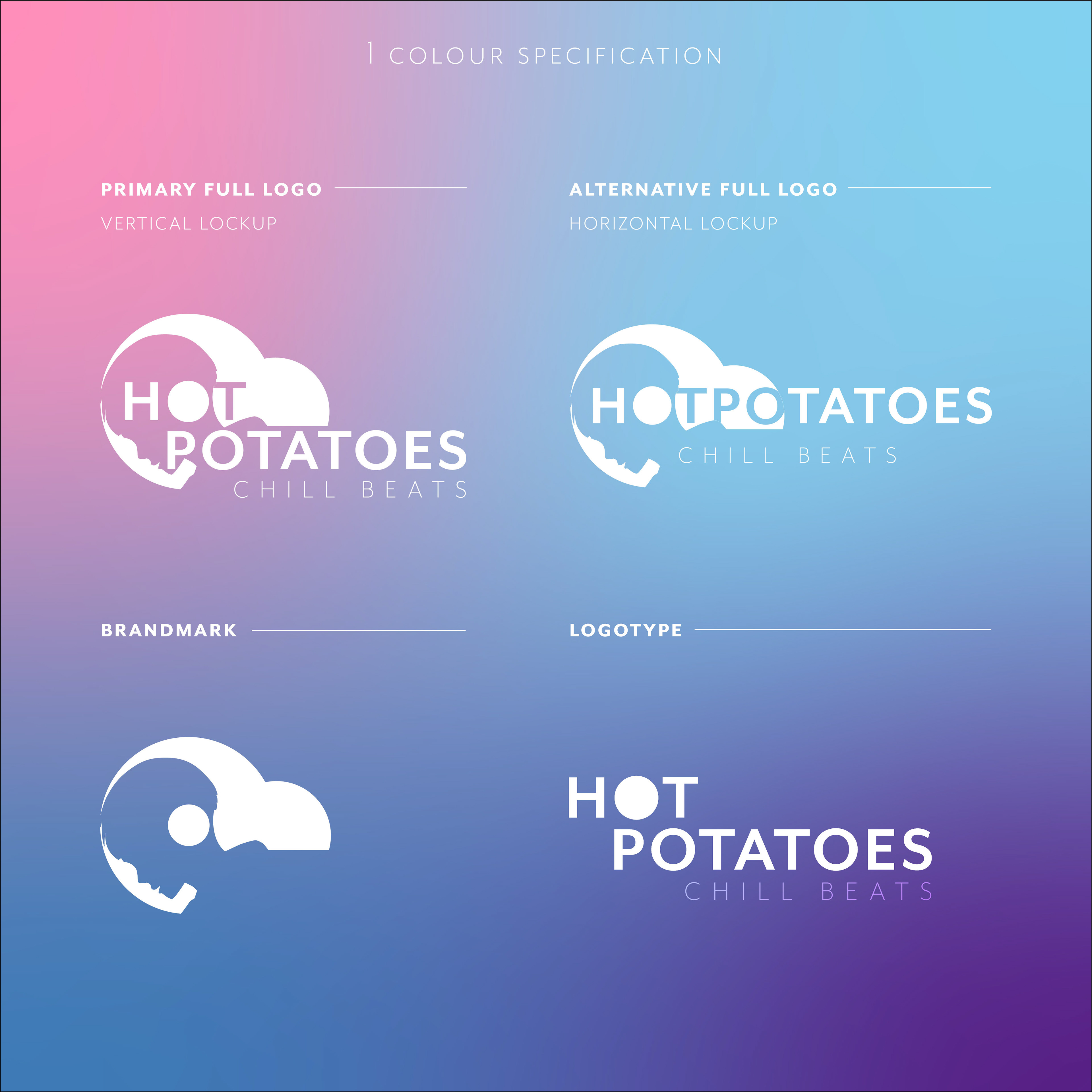
The anime boy is used to preserve the current brand personality. He is wearing a headphone and creating music through his midi keyboard.
The cloud is an element generally associated with dreams and mellow vibes.
Raw unpolished sounds like vinyl record scatches and clicks are some of the main features of lofi music. The center of the vinyl coincide with the anime boy headphone creates a special interaction, which can be interpreted as the boy being the creator of the music.
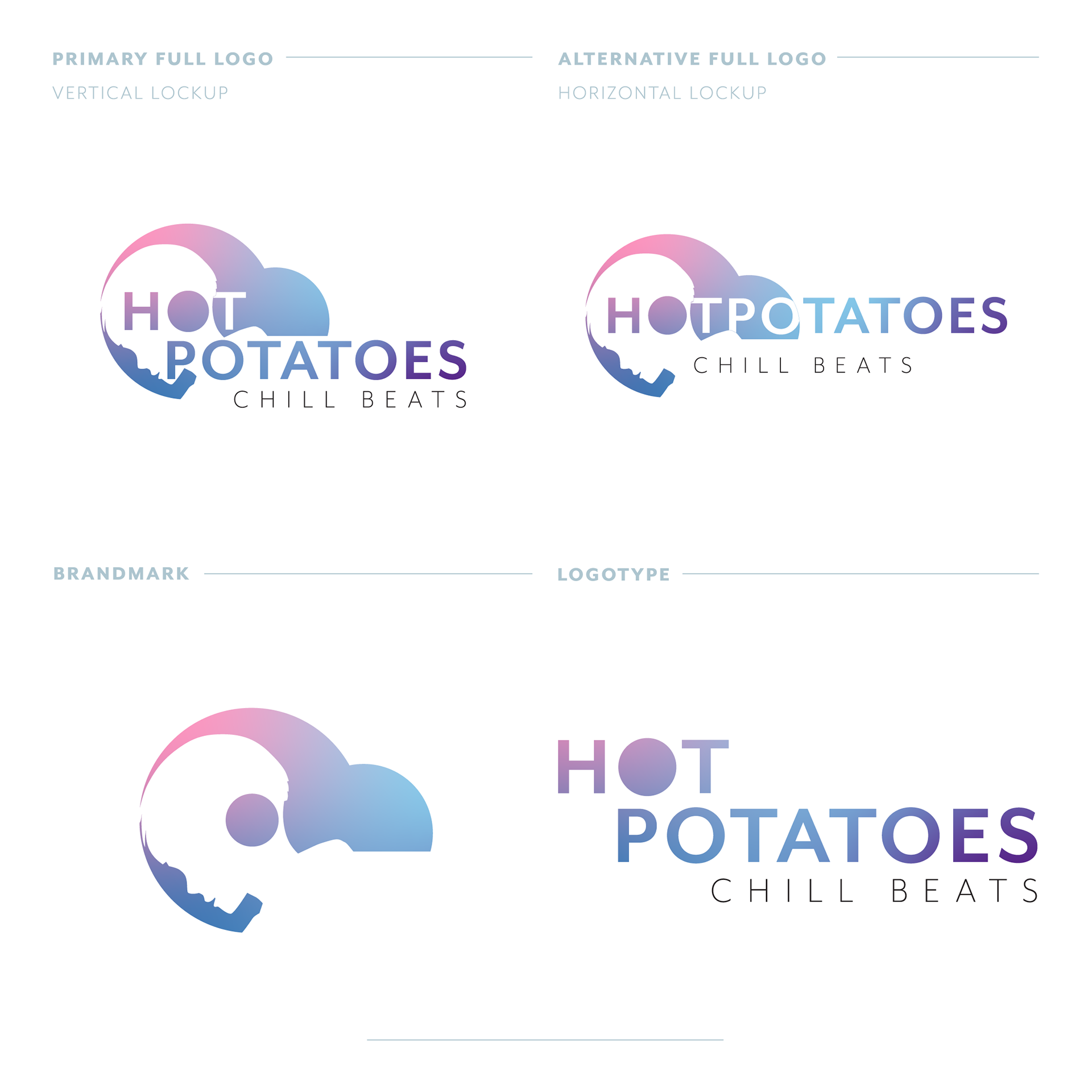
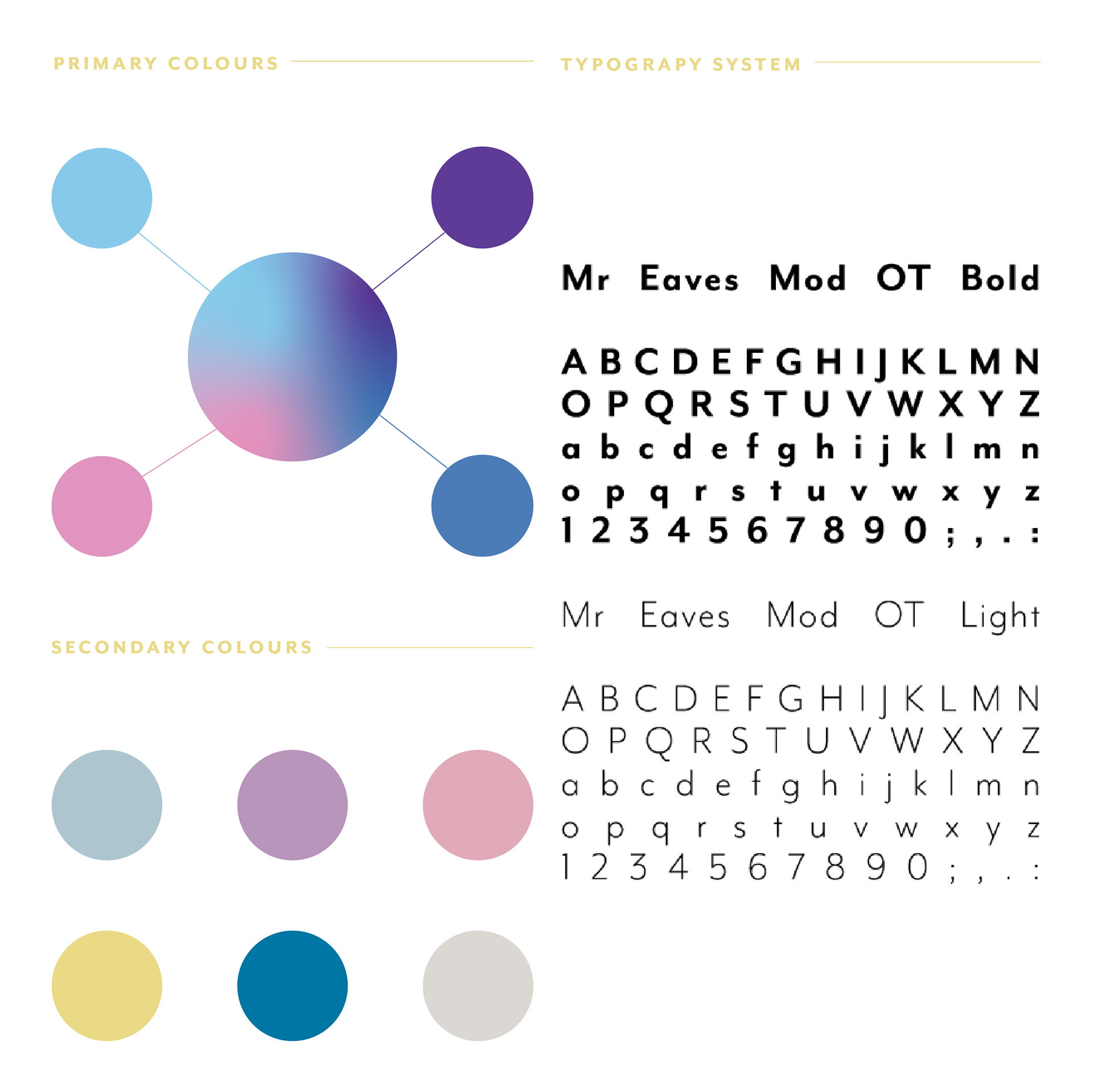
A clean and modern typeface Mr Eaves Mod OT is used in the logotype which carries Hotpotatoes' chill and straightforward personality.
The tagline “CHILL BEATS” indicates simply that HOTPOTATOES create chill music.

Identity System
This includes typography, colour schemes, and graphical elements which will be used across all marketing materials.
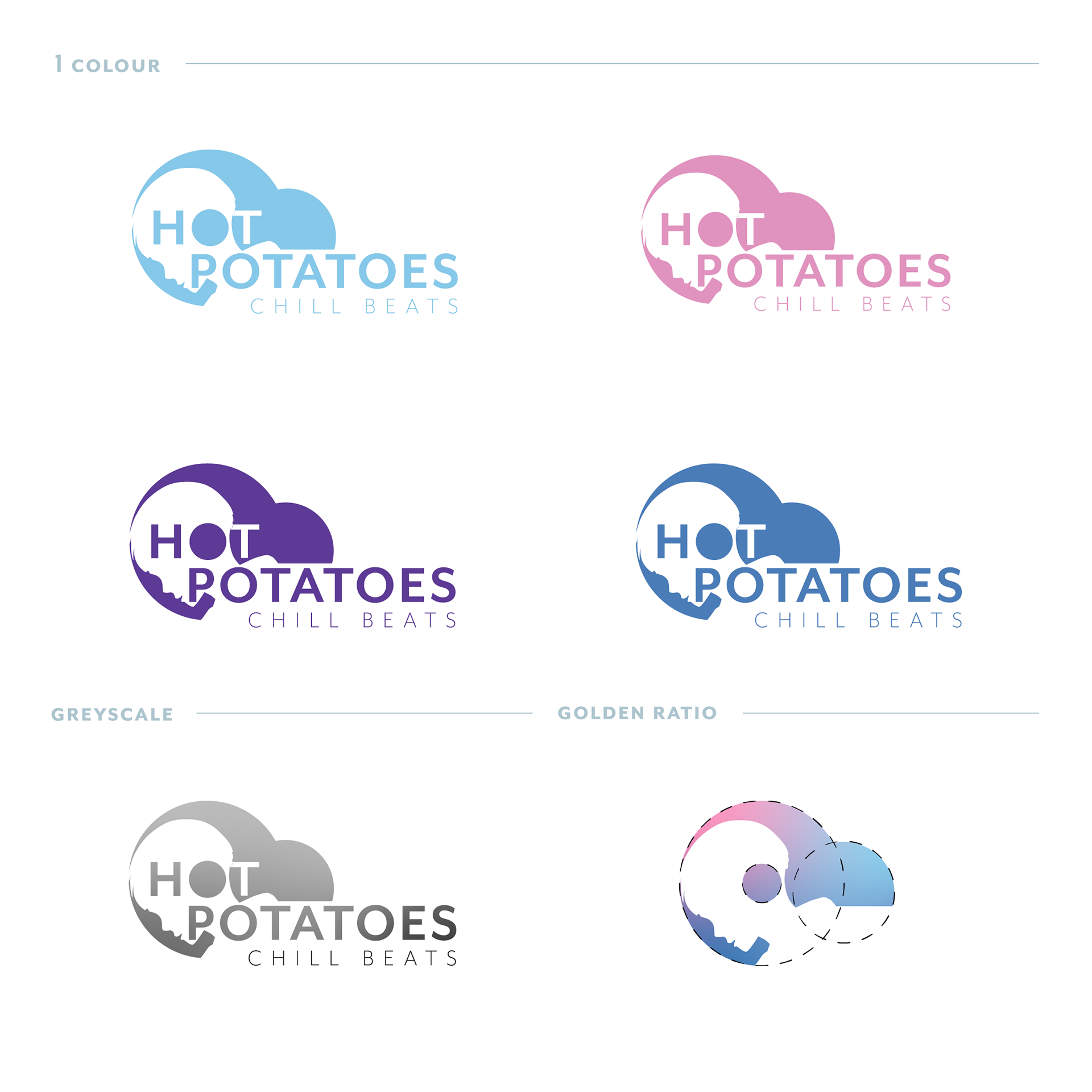
Colour and Typography
The primary colours are made up of vibrant pink, blue, and purple inspired by the existing colour palette used by the HOTPOTATOES.
The secondary colour palette comprises pastel colours to create a dreamy aesthetic. The colours may be used as highlight colours, accents or in graphical elements.
Mr Eaves Mod OT is used as the standard typeface across the brand's collaterals.
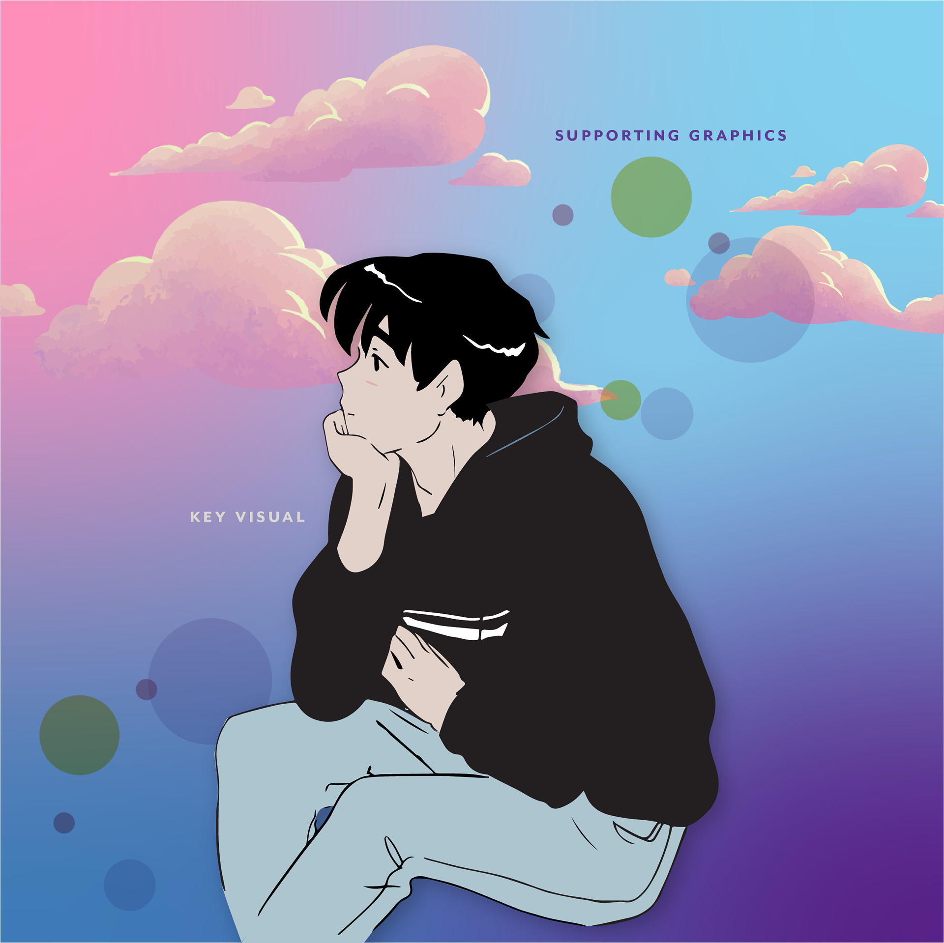
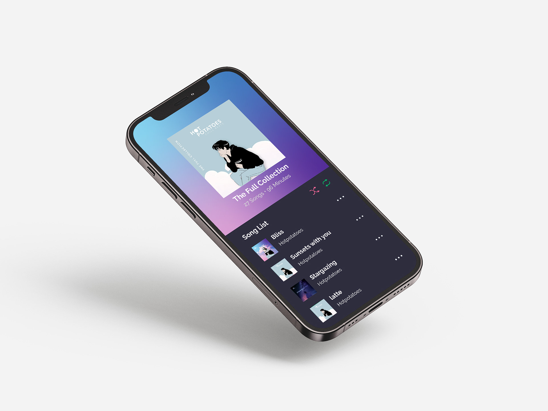
Key Visuals and Supporting Graphics
The anime boy will be the key visual of Hotpotatoes. He will usually appear in black hoodie most of the time but will occasionally put on other clothing on special occasions.
Pastel clouds and bubbles adds on a dreamy aesthetic to the design and they help pull together the entire look and feel of the brand.
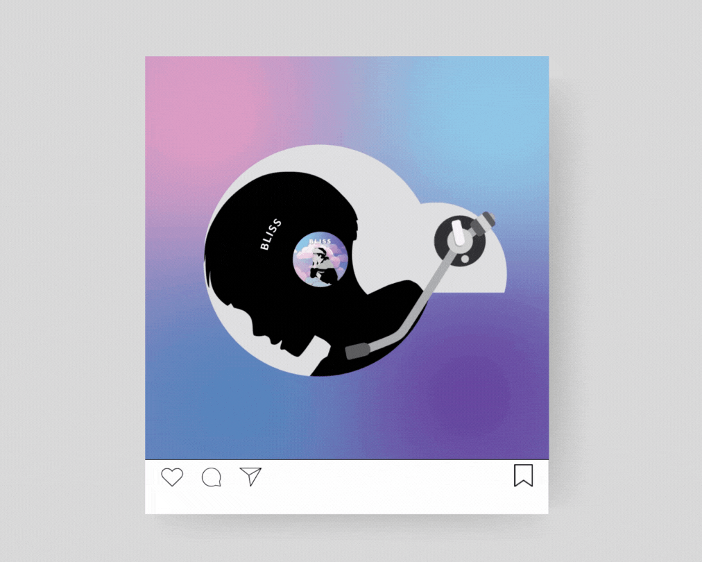
A Logo turned Vinyl Player
The logo can be playfully transformed into a vinyl player which will be playing all the musics from Hotpotatoes. It can be used as a social media post to play a newly released music, or to feature a collection of music.
Work done in fulfilment of Diploma in Communication Design course provided by Orita Sinclair.